
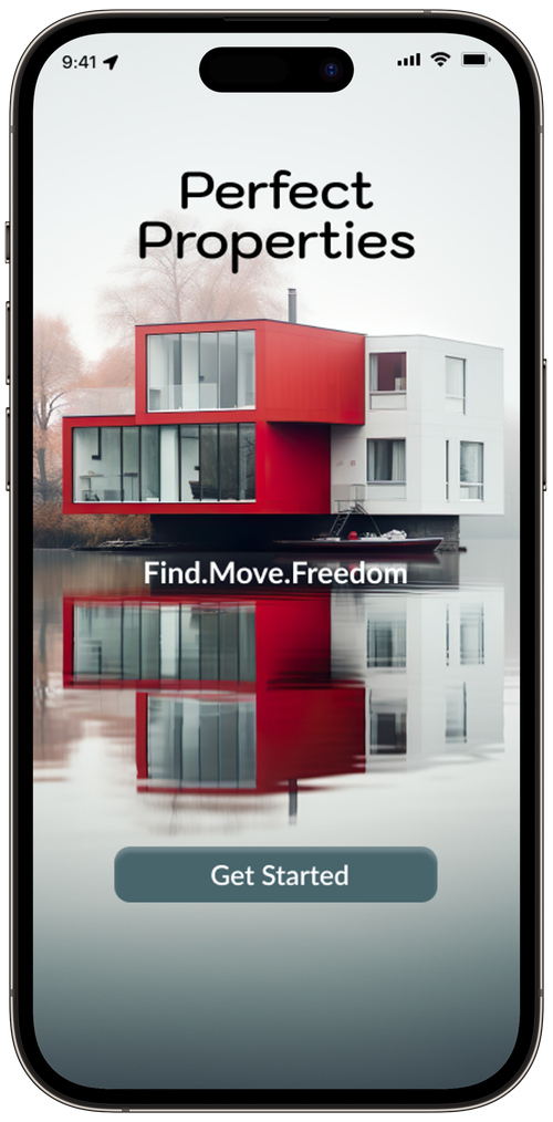
Perfect Properties
Overview
Real Estate has become an integral part of the rising economy in the world today and financial security for years. Tho, there are many sites offered to users, there is a main issue for new buyers that they get confused or flustered when looking for homes via a mobile or web app. This where the Perfect Properties app steps in.


“I want to be able to search and filter thru properties, so I can find good matches based on my needs.”
Persona
Emily
37
Married w/ 2 Children
BA Computer Science
MA Advanced Computer

Challenge
Perfect Properties needs to give new buyers an opportunity to find homes quickly and efficiently. It needs to offer them a selection of homes that are near their options. Lastly, there has to be an easier way to contact the agent towards said home.
Goals
Invest in property near good schools and neighborhood that primarily has children
Find the correct info for fast decision-making
An app that quickly gives me the correct tools to find the right home
As we get a glimpse of Emily and her needs, we can then move into what certain things she is looking to get out of the app.
Pain Points
While constantly being on the road, I need a way to gain home information quickly
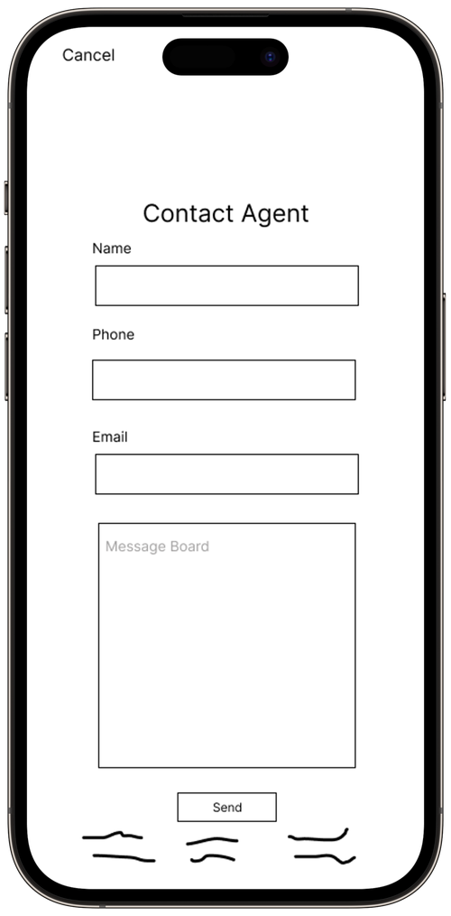
As a parent, I am constantly getting interrupted in some way, so I need an easy way to contact a real estate agent
Though I am in IT, I still need an app that is great for first time buyers
User Stories
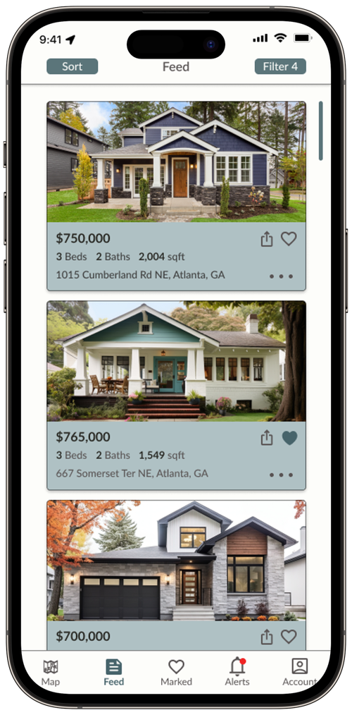
“I want to be able to save the properties I am interested in, so I can come back to them later.”
If you would like to view more of the style guide, please click the link to the right.

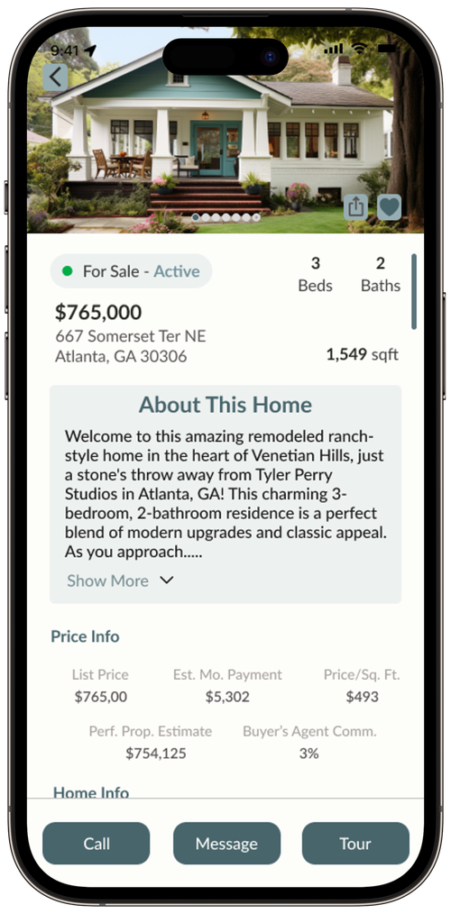
“I want to reach out to the right people towards the house I’m interested in, so I can view it.”
Now, with getting an idea of what Emily is looking for in an app, we can then go into the overall outline of the app.
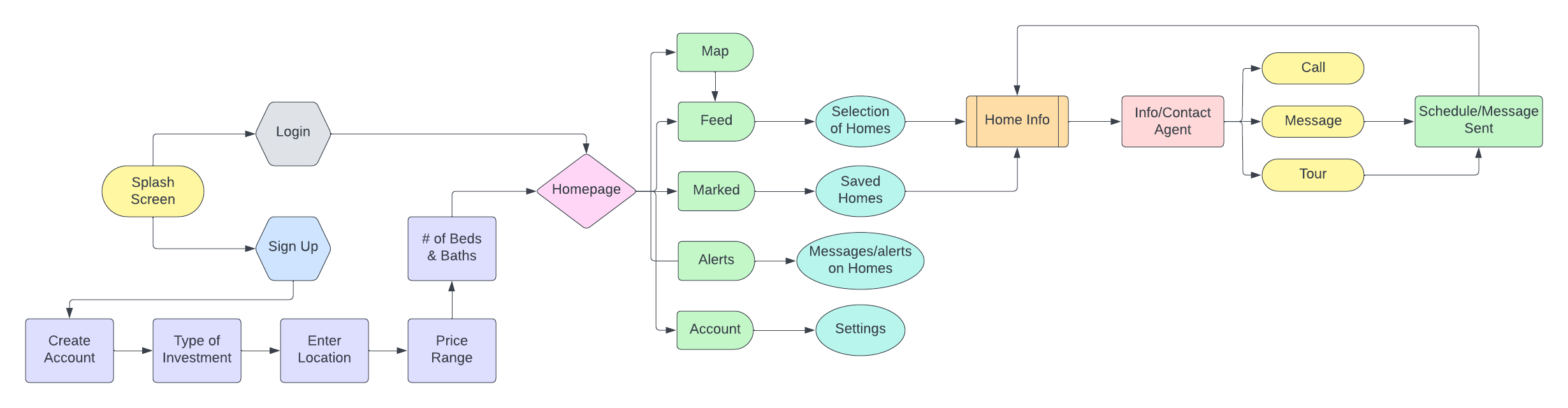
User Flow
As we dissect the user flow and understand the outline, we can then move on to getting an idea of the creative side of the app.
Icons

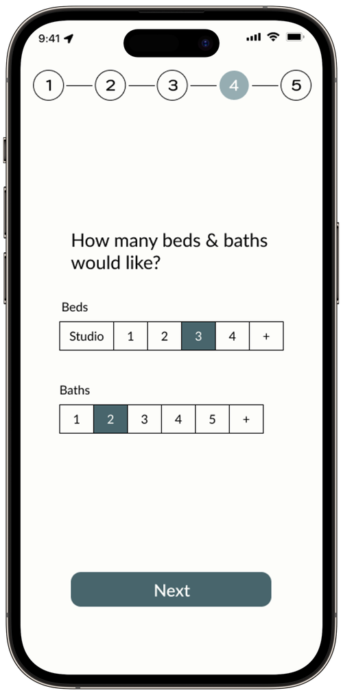
"I want to check if the property fits my needs and compare it to others, so I can narrow down my given choices."
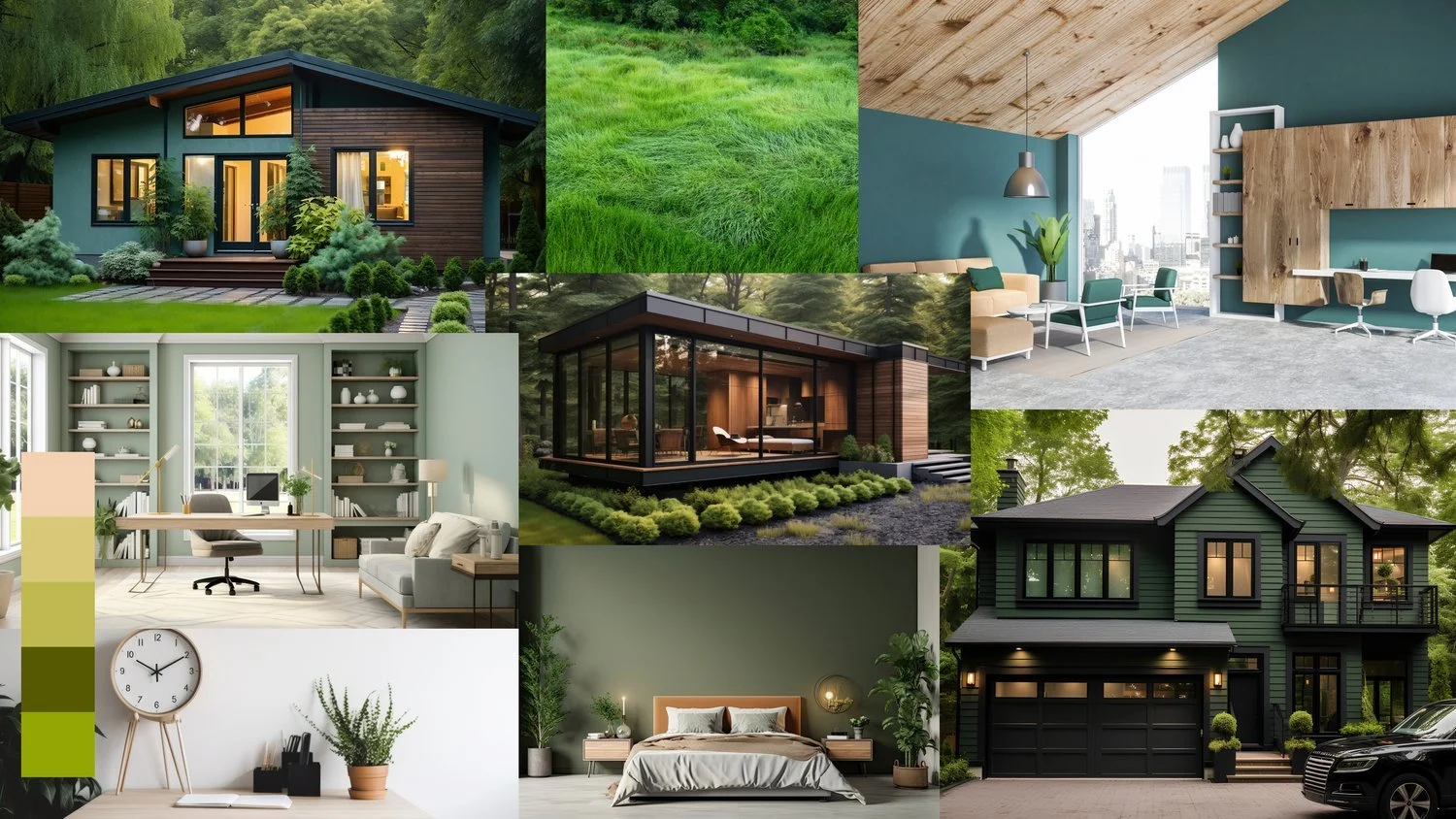
Mood Board
Organization, refinement, and proper color choices are essential for app development today. Simplifying the app to attract more first-time buyers was key to the project's success. The main lesson learned was the importance of patience, as I had to repeatedly redesign some pages to make information more accessible for users.

Gaining a broader idea of the look from different breakpoints, now pushes us onto my favorite part which is bringing in color and defining elements of the app.
Style Guide
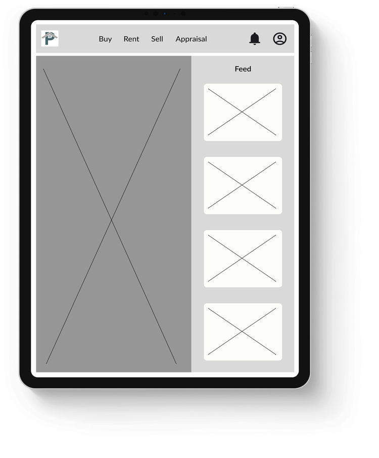
Though you have seen the proposed final of mobile, we will now introduce you to the finals of the other breakpoints.
Break Points
Text


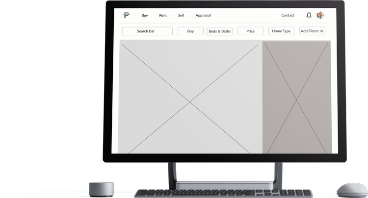
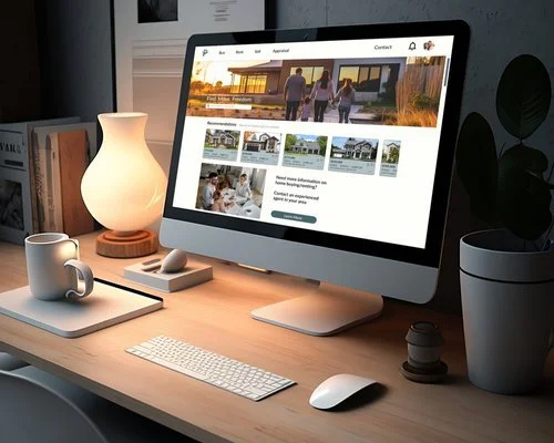
Now that we have an idea of how we would like the app to be viewed, we can implement that to high scale and introduce the final look of the app.
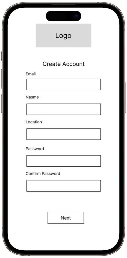
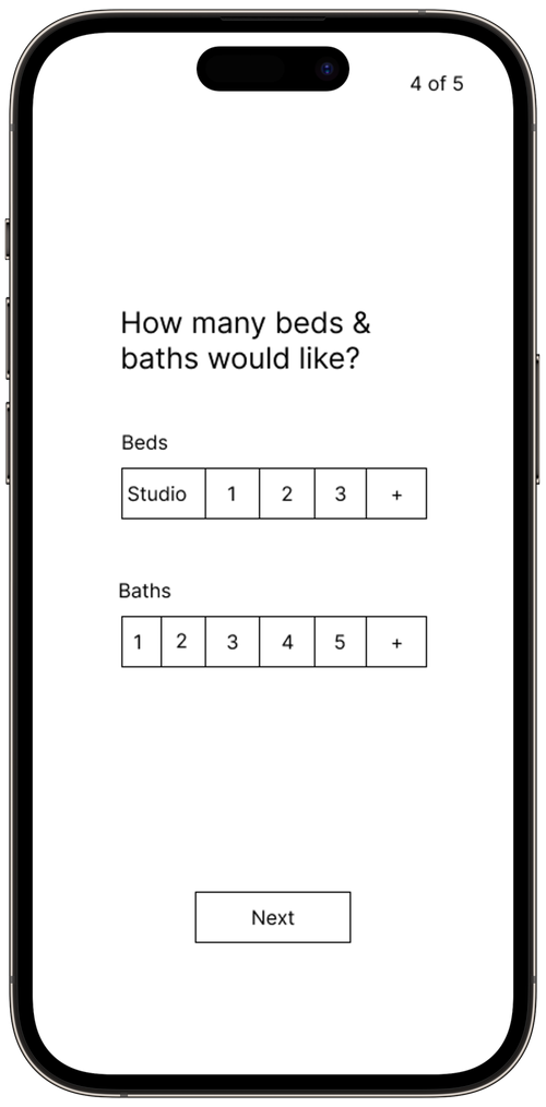
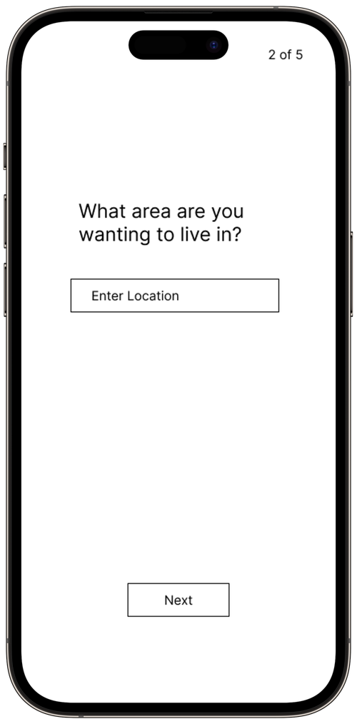
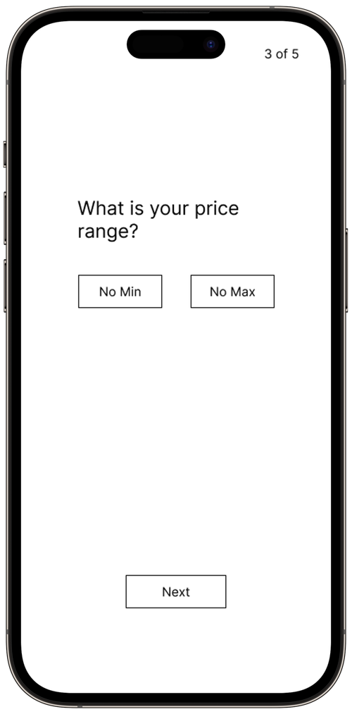
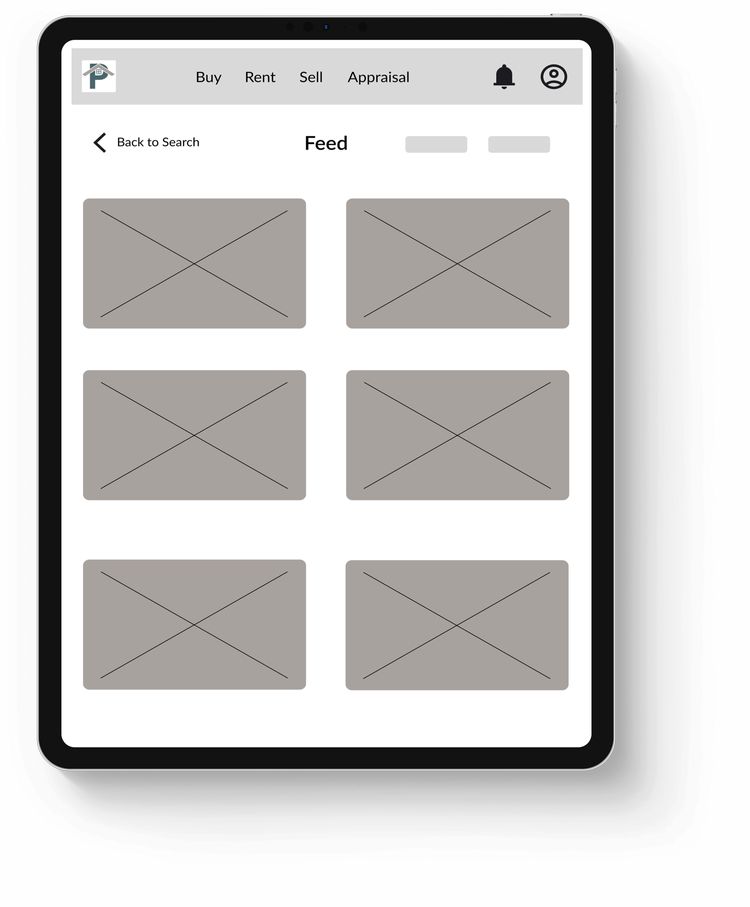
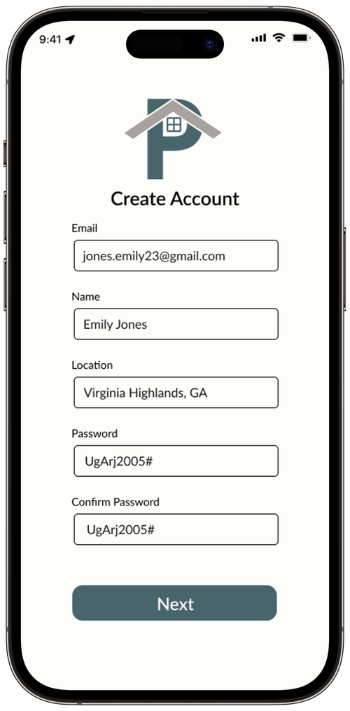
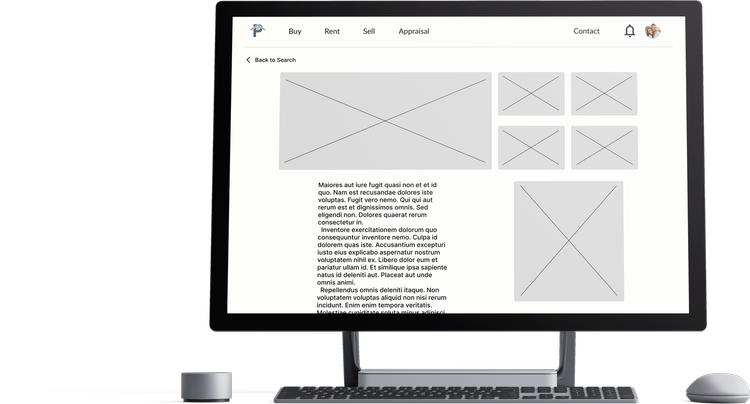
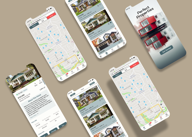
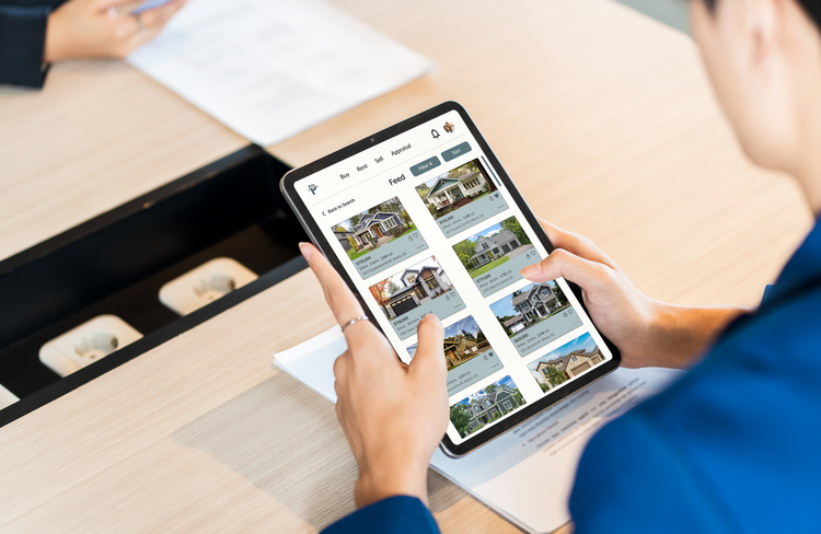
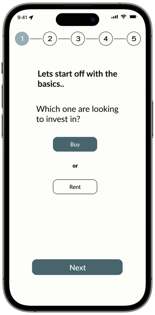
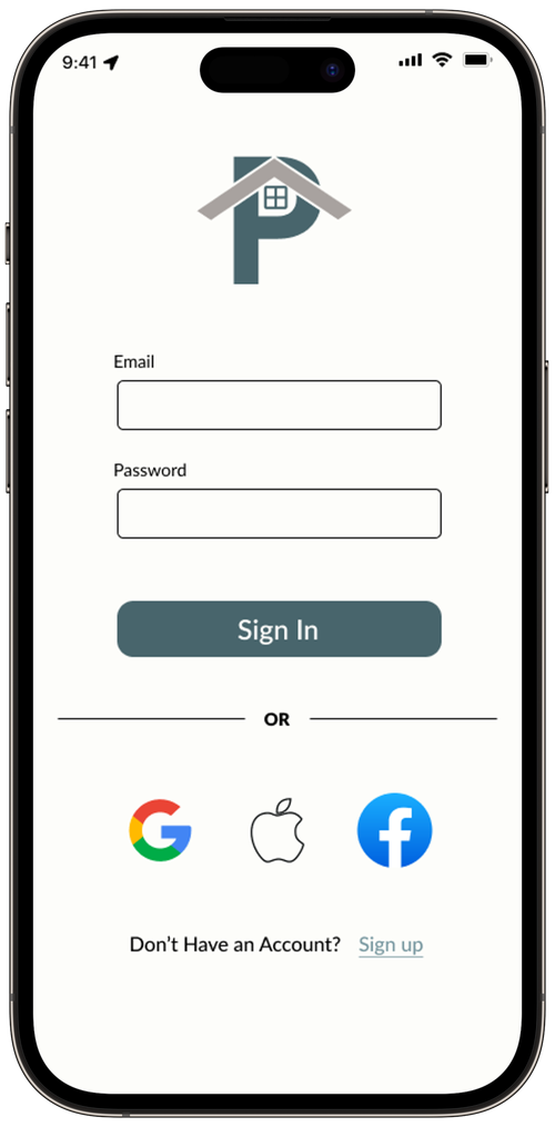
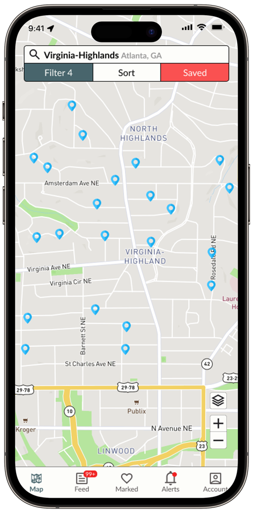
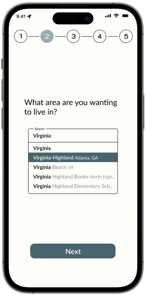
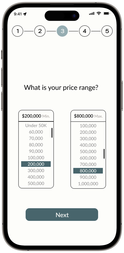
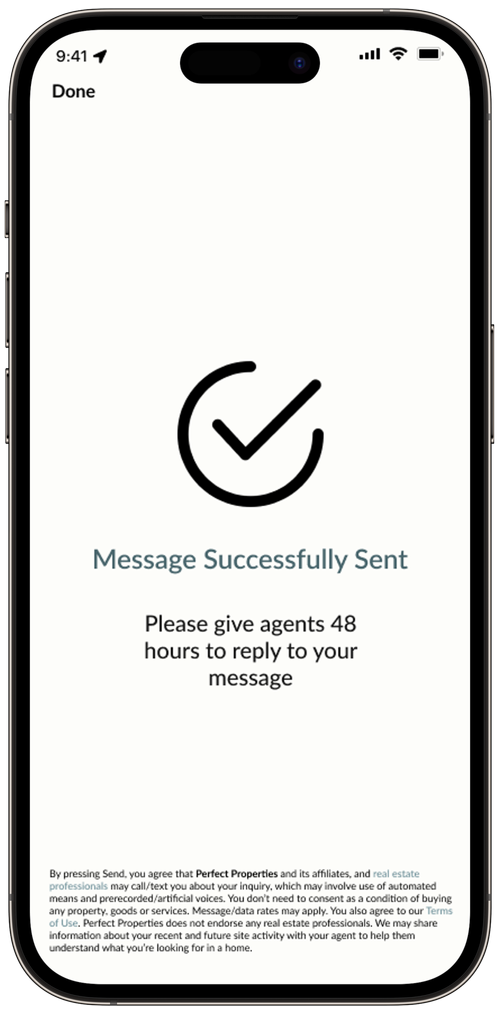
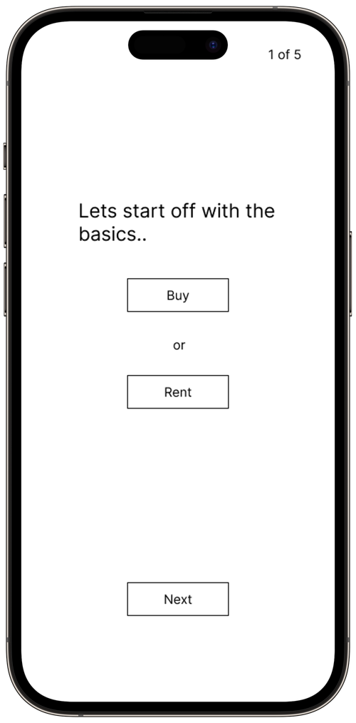
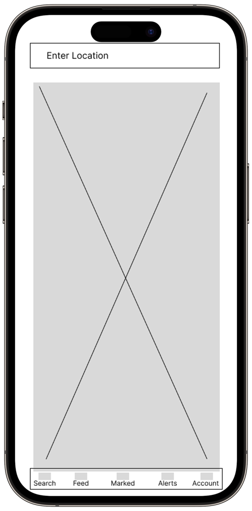
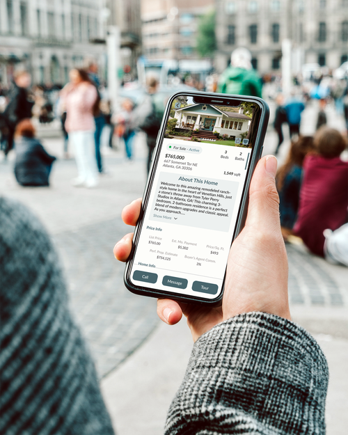
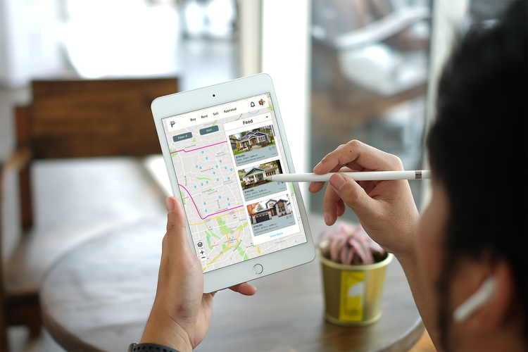
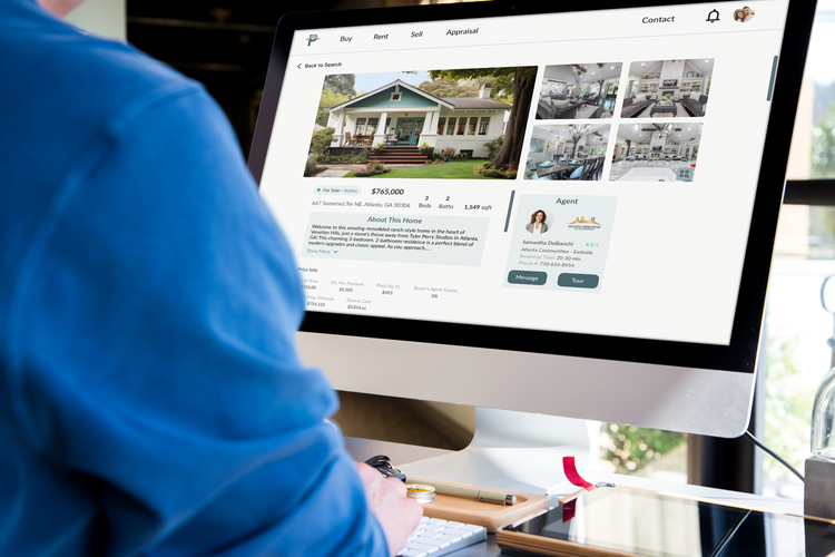
High Fidelity Wireframe
UI

Images


With having a bit of a background of the app and its challenges, we will now be able to see an overview of the user.
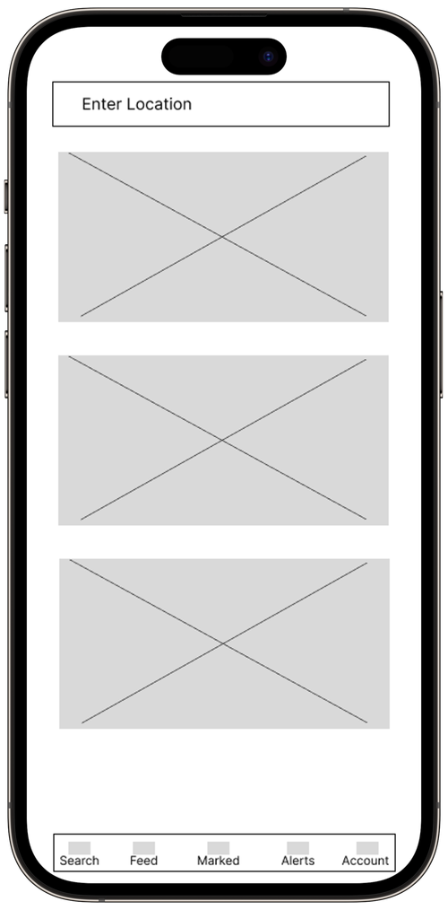
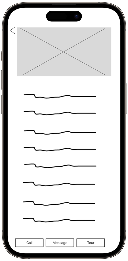
Low Fidelity Wireframe
Takeaways
What did you learn from a UI perspective?
What would you have added to your project?
Add a feature for users to click on home markers to display a small image with the price. For the alert page, include location recommendations, offering alternatives in the same state that might have better pricing and schools while meeting user preferences. Lastly, refine the onboarding process for more tailored home options.